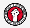
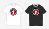
A silent but very generous member (who also happens to be a professional graphic designer, unlike myself!) has offered up a couple of his ideas on a new logo for the site! These look pretty awesome.. I think the horizontal one would look great up top, with the circular one and our original "burst" logo offered as T-shirt options? What do you all think?
You are using an out of date browser. It may not display this or other websites correctly.
You should upgrade or use an alternative browser.
You should upgrade or use an alternative browser.
New Logo... ?
- Thread starter REVOLUTION
- Start date
Vengeance
Well-Known Member
I like the existing one, but I hate change ")
I like the way the existing one incorporates the flippers at the bottom of the logo.
I like the way the existing one incorporates the flippers at the bottom of the logo.
hippochrome
Member
Vengeance said:I like the existing one...
I like the way the existing one incorporates the flippers at the bottom of the logo.
+1
But the circle one is very cool!
actually the old and the new could likely be combined.. I really dig the typeface and layout of the new horizontal one. Maybe if we just ditched the fist on that and kept the original emblem to the left?
Vengeance
Well-Known Member
Yea get rid of the fist on the Horizontal one and use that as the next text and keep the original logo
tim.sanderson
Active Member
Vengeance
Well-Known Member
You should get me some PBRev official sponsor Tshirt and I'll wear it to every Tournament I attend
Vengeance said:Yea get rid of the fist on the Horizontal one and use that as the next text and keep the original logo
I agree with Adam's suggestion and the second one will look great on a t-shirt for sure.
Vengeance said:You should get me some PBRev official sponsor Tshirt and I'll wear it to every Tournament I attend
Actually I'd like to put some prize packs together for TOPL at some point
DRANO
Super Member
Use them all!
I actually like the original too, but all of these are great and can be used in different ways.
I don't mind the idea of removing the fist in the horizontal version, but it would be cool to maybe repalce it with a USSR style revolutionary symbol (sycle or AK47 style) but pinball related
Maybe a spoof on some Marxist or communist revolutionary propaganda posters. Why not?
REVOLUTION said:actually the old and the new could likely be combined.. I really dig the typeface and layout of the new horizontal one. Maybe if we just ditched the fist on that and kept the original emblem to the left?
Bingo! Do that Brock.
yes like thisMagneto said:I like the second but I think would be easier to read ``Revolution`` from left to right instead of upside downish